 Signs & Large Format Print
Three terms that often get mixed up
| Term | What it is | What it looks like in practice |
|---|---|---|
| Logo | a company's graphic mark: a symbol, a wordmark or both together | a file with the name and symbol that goes on the sign and business card |
| Visual identity | the visual system built around the logo | colours, typefaces, material layouts, signage, vehicles, clothing |
| Branding | building the brand's whole image | name, customer promise, tone of voice, service, plus the visual layer |
| Brand guidelines | a document with the rules for using the logo and identity | a PDF of a few to a few dozen pages for every supplier |
Put simply: the logo is the signature, the identity is the way you dress, and branding is the character. You can have a great logo and a bland image, and the other way round, companies with a very simple mark can be highly recognisable because they have done everything the same way, consistently, for years.
What brand guidelines contain
Brand guidelines (also called a brand book or identity manual) need not be a thick volume. For a small business a few pages are enough, as long as they are specific. A typical scope:
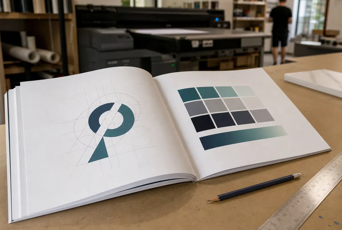
- Construction of the mark – what the logo consists of, the proportions of symbol to wordmark.
- Logo versions – primary, horizontal and stacked, one-colour, black and white, reversed for dark backgrounds.
- Clear space – how much free space there must be around the logo so nothing crowds it.
- Minimum size – the width below which the logo stops being legible (important for pens, stamps, lanyards).
- Colours – brand colours specified in several systems: Pantone for print, CMYK, RGB and HEX for screen, RAL for painted elements, sometimes a vinyl reference.
- Typography – the typeface for headings and body text.
- Incorrect use – stretching, changing colours, shadows, the logo on a busy background.
- Examples of application – business card, letterhead, sign, vehicle, clothing, website.
Larger companies add presentation templates, photography rules, iconography and tone of voice.
What a printer needs from your brand guidelines
From a production point of view, not every page of the guidelines matters equally. When a client sends us materials for a sign, a banner or vehicle graphics, we check above all:
- The logo as a vector. AI, EPS, SVG or PDF with text converted to outlines. Without a vector we cannot cut letters from vinyl, rout 3D letters or enlarge the logo for a banner without losing sharpness. More in our guide vector logo.
- Colours with references. If the guidelines give Pantone, CMYK and RAL, we match the colour to the specific material. If they only say 'our blue', we have to guess, and we would rather not.
- A version for dark backgrounds and a one-colour version. For an illuminated light box, laser engraving or letters cut from a single vinyl, a full-colour version with gradients will not work.
- Minimum size and clear space. That tells us whether the logo will still be legible on a lanyard or on a wobbler arm.
If your brand colour is very important to you, before a large order make a test print on the final material (A3 approx. €13 net) or a contract proof (approx. €38 net).
- 01Brief
Description, sizes, site photos and deadline — a few sentences are enough.
- 02Design and quote
Our designers prepare artwork or a visualisation and you get a price.
- 03Approval
You approve the design; for brand colours we provide a proof.
- 04Production
35+ machines in our own plant in Poland: 3.2 m UV print, CNC, laser, 3D, sewing.
- 05Installation or delivery
Own crews and vehicles across Europe, partner network, couriers worldwide.
Who designs the logo and guidelines, and who carries them onto materials
The logo and brand guidelines are designed by a graphic designer – with us, by the trained designers in our own studio, so the mark is created from the start with an eye to how it will look on a sign, a vehicle and in print. On large branding projects an agency starts with strategy: who the customer is, what should set the company apart, what the name should be, and only then derives the mark. For small businesses a good designer and a conversation about what the company does and who it talks to are often enough.
Our design studio works where design meets production: it vectorises logos from bitmaps (approx. €26 net), adapts finished designs to further formats (approx. €13 net per format), prepares company stationery and advertising in line with the guidelines, and charges complex projects at approx. €35 net per hour of studio time. We also know how a logo will behave in real materials (backlit, on mesh, on a T-shirt, engraved) and flag it before anything goes into production. Details: graphic design and DTP.
A logo that works on screen but is hard to produce
More and more often we receive logos designed solely for a phone screen. They look great on Instagram but cause trouble in production. What to watch for before you approve a logo design:
- Gradients and shadows. They can be printed, but you cannot cut them from vinyl, embroider them or make 3D letters from them. A flat version is needed.
- Very thin lines. They disappear on a business card, and in dimensional letters they are impossible or fragile.
- Neon screen colours. A vivid RGB green or pink has no equivalent in CMYK print – the print will always be more muted.
- A long name with a strapline on one line. On a sign above a narrow entrance it becomes a strip of letters a few centimetres high.
A good designer will show the logo in several applications (on a sign, on a vehicle, on a pen) before handing over the files. It is worth asking for.