 Signs & Large Format Print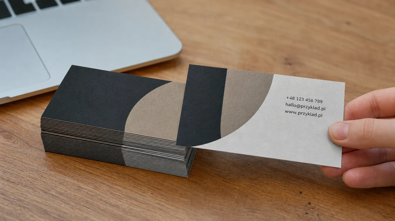
What a visual identity consists of
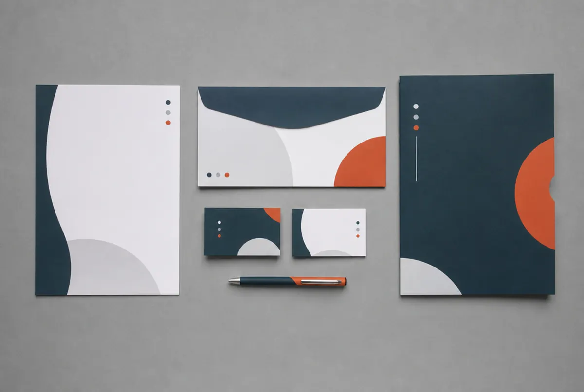
Many people think a visual identity is simply a logo. The logo is its heart, but on its own it does not bring order to anything. Identity is the whole system, and only when all its parts work together does a customer recognise the company by the colour of its van or the shape of its sign before reading the name.
In practice we split it into four layers:
- Fundamentals: the logo (in versions – horizontal, stacked, one-colour, reversed for dark backgrounds), brand colours with references, a typeface, and possibly a graphic device or pattern that repeats.
- Company stationery: business cards, letterheads, envelopes, presentation folders, a stamp, an email signature, quote and invoice templates.
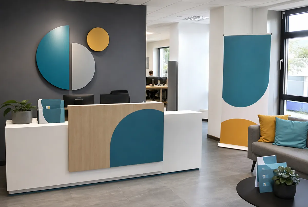
- Signage and surroundings: a sign or light box, window graphics, door signs, interior signage, company vehicles, staff clothing.
- Digital channels: the website, social media profiles, post templates, the Google Business Profile.
The rules for all of this are written down in brand guidelines, or a shorter brand book. The differences between a logo, branding and brand guidelines are covered separately in logo vs branding.
What printing company materials costs
| Item | Option | Indicative price |
|---|---|---|
| Business cards | 90 × 50 mm, 4/4, 350 g matt art board, 500 pcs | approx. €15 |
| Letterhead | A4, 4/0, 90 g offset paper, 500 pcs | approx. €49 |
| Presentation folders | A4, 4/0, 350 g matt art board, matt lamination, 100 pcs | approx. €135 |
| Entrance sign | 3 mm dibond with UV print, 150 × 50 cm (0.75 m² × €55) | approx. €41 |
| Door sign | 3 mm acrylic, printed with white underlay | approx. €43–60/m² |
| T-shirt print | A4 transfer, 20–49 pcs | approx. €3.30 each (print only) |
| Vehicle graphics | cast vinyl with UV print + laminate | approx. €19–29/m² + approx. €8/m² |
Indicative prices for business cards and small print are in our product catalogue; treat the figures in the table as a reference point. At larger quantities the unit price drops noticeably: 1000 letterheads cost approx. €60 net, not much more than 500.
How to roll out an identity step by step
You do not need to order everything at once. A sensible order looks like this:
- Lock down the fundamentals. A vector logo (AI, EPS, SVG or PDF with outlines), colour references (ideally Pantone for print, CMYK, RGB for screen and RAL for painted elements) and a typeface. Without these every new supplier is guessing.
- Do what customers see every day. Entrance signage, business cards, your Google Business Profile, your email signature.
- Sales materials. Letterhead, folders, a quote template – if you send proposals or meet clients.
- Surroundings and people. Vehicles, clothing, interior signage.
- Write down the rules. Even on two pages: what the logo looks like, what the colours are, what not to do. Give it to everyone who designs anything for you.
We adapt files and designs in-house – moving a finished design to another format costs approx. €13 net, and if you only have the logo as a JPG, vectorising it costs approx. €26 net. More complex design studio work is charged at approx. €35 net per hour.
- 01Brief
Description, sizes, site photos and deadline — a few sentences are enough.
- 02Design and quote
Our designers prepare artwork or a visualisation and you get a price.
- 03Approval
You approve the design; for brand colours we provide a proof.
- 04Production
35+ machines in our own plant in Poland: 3.2 m UV print, CNC, laser, 3D, sewing.
- 05Installation or delivery
Own crews and vehicles across Europe, partner network, couriers worldwide.
The most common mistakes we see in files
Over the years thousands of company files have passed through our hands, and many problems recur:
- Five shades of 'the same' colour. One supplier made the sign, another the business cards, a third the T-shirts, and each matched the red by eye. The fix: one colour reference and, if needed, a proof or a test on the material before a big order.
- The logo in one version only. A colour logo on white looks fine on a business card, but what about engraving, white cut vinyl on glass or an illuminated light box at night? You need a one-colour and a reversed version.
- Small text in the logo. A strapline under the name, legible on screen, disappears on a pen and on a sign seen from the street.
- A logo from a screenshot. A 300 × 200 pixel file is no good for a banner or for cutting letters. Sooner or later it has to be redrawn.
- Every item 'a bit different'. A new flyer in a different style because the designer fancied a change. Customers do not need to notice consciously – the company simply seems less organised.
Identity online and on paper – one whole
Customers often first see your company on their phone, and only later in the street. So the colours and logo on your website, social media and Google Maps should be exactly the same as on your sign. Take particular care with colours, because a screen emits light while paper reflects it – the same colour in RGB and CMYK will look slightly different. We cover this in CMYK or RGB.
A website in a consistent identity can be ordered through our sister service weblango.com, and social media templates can be prepared by a designer or the marketing agency that runs your profiles. What matters is that everyone works from the same source files.