 Signs & Large Format Print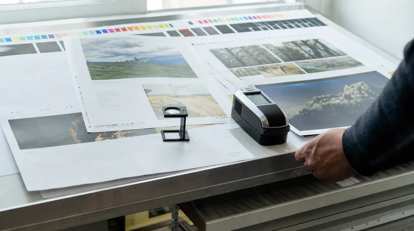
RGB and CMYK: how they differ in practice
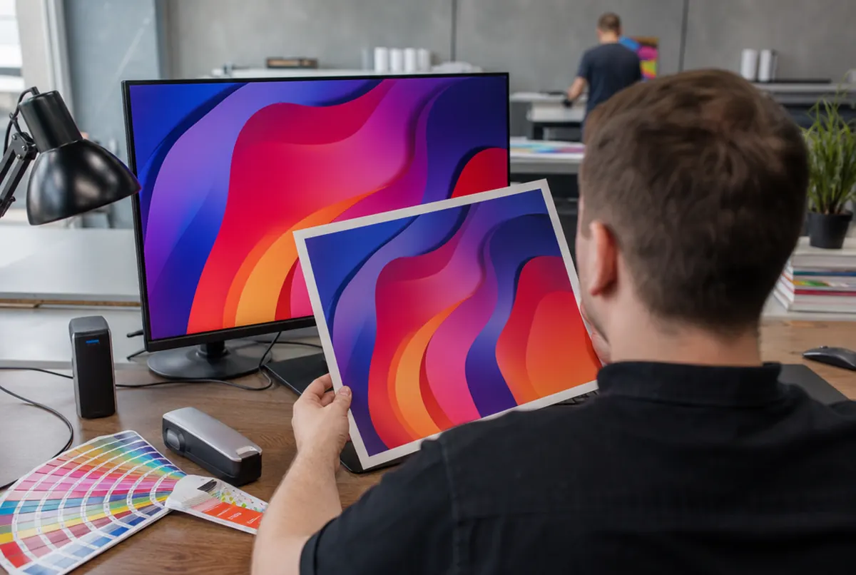
A monitor emits light. Each pixel is made of red, green and blue light, and colours are created by adding them: the more light, the brighter, and all three at maximum give white. That is RGB.
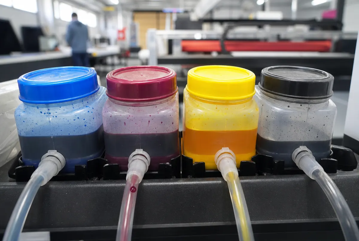
Paper does not emit light; it reflects it. Ink absorbs light, so colours are created by subtraction: the more ink, the darker. Digital and offset printing use four inks: cyan (C), magenta (M), yellow (Y) and black (K). That is CMYK.
The whole problem comes from this difference. The range of colours a good monitor can show is wider than the range that can be printed. It is most visible with:
- intense, neon-like greens and turquoises,
- bright blue (the typical on-screen blue),
- saturated orange and purple,
- very light, luminous pastels.
After conversion to CMYK these colours lose some of their glow. It is not the printer's or the machine's fault: it is physics.
Why the print differs from the screen even when the file is CMYK
Clients sometimes send a correct CMYK file, yet the print still looks different from their monitor. There are several reasons, and they usually act together:
- Screen brightness. Laptop and phone screens are set very bright with boosted contrast. On paper the same design seems darker.
- No calibration. Every monitor shows colours slightly differently. On two screens in the same office, the same file can look like two different designs.
- Paper. On gloss coated paper colours are livelier, on matt calmer, and on uncoated and eco papers noticeably darker and less saturated.
- Lighting. A print viewed under a warm lamp looks different from one by a window in daylight.
- A phone instead of the file. Sometimes a client approves the design on a phone and compares the print with a photo from a messaging app. There, comparing colours makes no sense at all.
So for a brand colour that must be consistent, we do not rely on the screen but on a swatch book or a test print.
How to prepare a CMYK file, step by step
- Start the design in CMYK mode if you know it is going to print. Converting at the end also works, but then you only see how the colours change at the end.
- When converting from RGB, use a profile for coated paper (e.g. the common European profile for coated stock). If you are not sure which to choose, ask us and we will advise.
- After conversion, look over the design and correct colours that have gone flat. Sometimes a slight shift in hue is enough to bring back the character of the design.
- Set small black text to 100% K, with no other inks. Four-colour black on small letters can give a coloured fringe.
- Make large black backgrounds rich black, e.g. 100% K with other inks added, but without overdoing it: total ink coverage should not exceed about 300%, otherwise the paper may misbehave and the ink set off.
- Check photos separately after conversion. Skin, food and sky are where differences show first.
- Save the print PDF keeping CMYK, without converting again on export.
If you send an RGB file, we will not reject it. We will convert it before printing, but then the colour after conversion is chosen by the profile, not by you. For an ordinary flyer that usually does not matter; for a company's identity it often does.
Greys, gradients and light backgrounds: less obvious pitfalls
It is not only bright colours that cause trouble. A few things only show up on paper:
- Four-colour greys. A grey built from CMYK can drift slightly towards green or pink in print. Neutral greys for text and small elements are better built from K alone.
- Very light backgrounds. A tint at 3–5% coverage is visible on screen but can almost disappear on paper.
- Long tonal gradients. A gradient from one light colour to another sometimes shows faint banding. Adding a little noise to the gradient helps.
- Phone photos. They often have boosted saturation and contrast. After conversion to CMYK they look flat, so it is worth correcting them first.
- 24 hexpress printing (UV inks need no drying)
- approx. 3 daysstandard lead time
- up to 14 dayslarge and custom projects with installation
Plus courier delivery. Tell us your date — we plan production around it.
Brand colour: Pantone, test print and proof
Many companies have their colour specified in the Pantone system. That is a guide to specific mixed inks, not a CMYK mix. Some Pantone colours can be matched very closely in CMYK, others only approximately, especially intense oranges, greens and metallics. Give us the Pantone number and we will tell you what to expect from digital printing. More in brand colour in print: Pantone and proofs.
When colour really matters, there are two routes:
- A test print on the actual material: an A3 sheet on the same paper the run will use. It costs approx. €13 net and shows the real result.
- A certified contract proof: a reference print with a guaranteed colour deviation of dE 2 or less. It costs approx. €38 net and serves as the benchmark for approval.
Both are described on the tests, prototypes and proofs page. For large runs of brochures or letterheads, the cost of a proof is small compared with the risk of a reprint.