 Signs & Large Format Print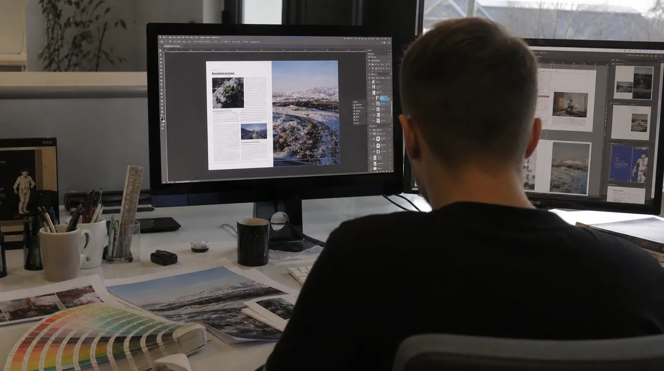
DTP vs pre-press – where design ends
The two terms are often confused, because sometimes the same people do both. The difference is in the purpose.
DTP is work on content and appearance: typesetting, page layout, preparing a catalogue, a flyer, a sign. A DTP designer makes sure everything fits the format, is legible and matches the company's identity. The result is a finished design, usually as a PDF.
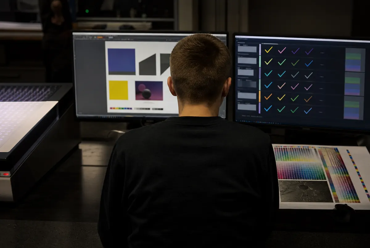
Pre-press begins once the design is approved. Nobody changes the content any more – now the point is for the press to print exactly what the client saw, at the right size, in the right colour and with the correct marks for cutting. It is a technical stage the client usually does not see, but it decides whether the print comes out without surprises.
With us both are done by our own in-house studio. If you only need the design, see the graphic design and DTP page; if you have a finished file, it goes to file preparation and preflight.
What we check in a file – the pre-press checklist
Every file goes through the same list before production. This is what it looks like in practice:
- Size and scale. Is the file the size of the product? For large formats we often accept files at 1:10 scale – then a 10 × 2 m banner is a 100 × 20 cm document. We check that the scale is stated and consistent.
- Bleed and safe area. For small format print, 3 mm of bleed on each side; for large format, an allowance depending on the finishing – for a weld, a pole pocket or wrapping round a frame.
- Colour mode. RGB files are converted to CMYK using a profile suited to the material. Vivid greens, blues and oranges suffer most – we cover this in CMYK or RGB.
- Resolution. For prints seen close up, approx. 300 dpi at 1:1; for banners usually 100–150 dpi; for billboards seen from tens of metres, less is enough.
- Fonts. They must be embedded in the PDF or converted to outlines. A missing font ends up substituted by a completely different typeface.
- Black. Small text in pure black (100% K), large black backgrounds in 'rich' black with other colours added – otherwise they come out grey.
- Total ink coverage. Too much ink in one place causes flooding and problems with drying or curing.
- Overprint. Set wrongly, it can 'swallow' white text or change the colour of an element.
- White and varnish. When printing on transparent or coloured material, white is printed from a separate spot colour in the file. It must be named and set to overprint.
- Cut lines. The contour for a plotter, router or laser must be a vector, in a separate colour, closed and without duplicate paths.
What happens next: imposition, RIP and profile
Once the file is correct, the part the client does not see begins.
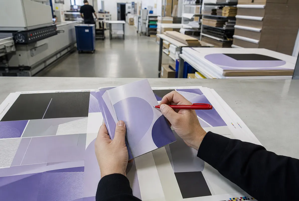
Imposition – arranging copies on the sheet or roll. Business cards are laid out several dozen to a sheet, stickers so that as little vinyl as possible is wasted, and a catalogue so that the pages fall in order after folding and stitching. In large format we split graphics wider than 3.2 m into panels with an overlap.
RIP (raster image processor) is the software that converts the PDF into ink droplets for a specific machine. This is where the colour profile for the material is chosen – banner prints differently from backlit film, which has to be saturated for illumination.
Proof. Where colour is critical we make an A3 test print on the final material (approx. €13 net, refunded on orders over 20 m²) or a certified contract proof (approx. €38 net). More in brand colour in print – Pantone, proofs and tests.
What DTP and file preparation cost
| Service | Net price | When it is needed |
|---|---|---|
| Technical file check and correction | included in the order price | always, before every production run |
| Adapting a file to another format | approx. €13 each | you have a roller banner and need a 3 × 1 m banner |
| Logo vectorising | approx. €26 each | logo only as JPG or PNG, but it is to be routed, plotter-cut or made into 3D letters |
| Simple banner or sign design | approx. €43 each | up to 2 rounds of changes |
| Studio time on complex projects | approx. €35 / h | catalogues, wayfinding systems, key visual adaptations |
| A3 test print on the final material | approx. €13 each | a new brand colour, an unusual material |
| Certified contract proof | approx. €38 each | colour accuracy required by contract |
Minor technical corrections (adding bleed from the background, converting fonts to outlines, converting colours) are done as part of the check. What is charged is work that changes the design: rebuilding the layout for another format, redrawing a logo, typesetting content.
The most common file problems we see
The same mistakes have recurred for years, so we will put them plainly:
- A logo from the internet or an email signature. It is 200 pixels wide and looks like a mosaic on a 3 m banner. The solution is a vector – we describe it in vector logo.
- A design from an online editor in RGB, without bleed. It can be rescued, but the colours may come out calmer than on screen.
- A file at the wrong scale with no note. We receive 50 × 20 cm and do not know whether it is 1:10 or the product really is that small.
- Text right at the edge of a banner. After hemming and eyeleting, an eyelet lands in a letter.
- Low-resolution photos placed in layout software. They look fine in preview, because the program shows a thumbnail.
We flag every such problem before printing, with a suggested fix. We do not print 'as is' if we know the result will be poor.