 Signs & Large Format Print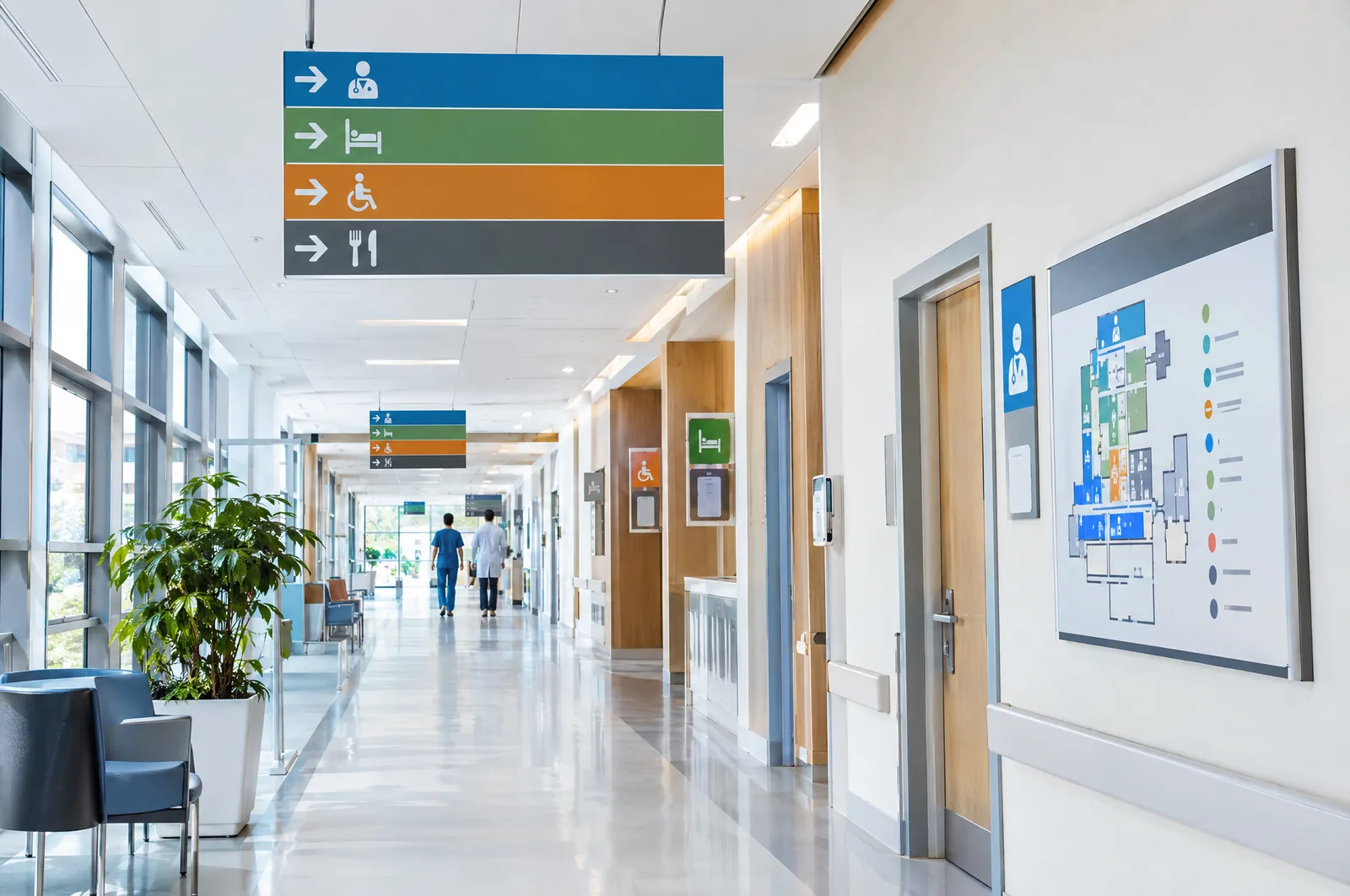
What wayfinding covers: from the entrance pylon to the door plate
A good signage system answers, in order, the questions a first-time visitor asks: is this the place, where do I park, which entrance do I use, which floor do I go to, which way do I turn and is this the right door. Each of those questions has its own sign.
- Site level: a pylon or totem at the entrance, car park signage, directional boards on site, the building number.
- Entrance: fascia sign, entrance identification (main, deliveries, accessible), opening hours.
- Lobby: a board with the site plan or tenant directory, reception sign, main directional signs.
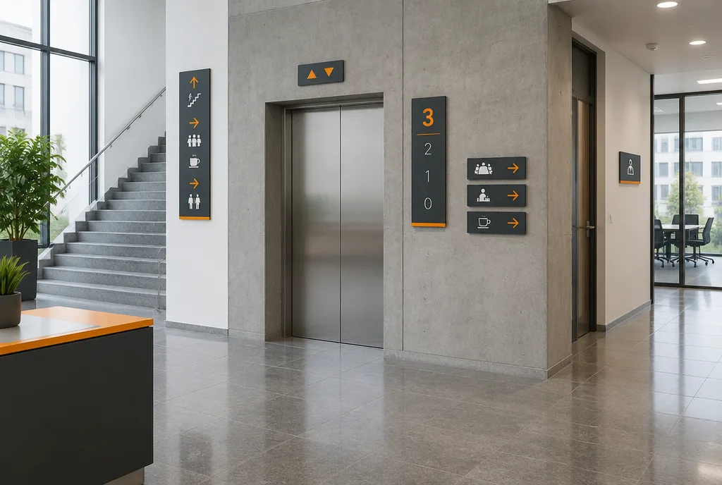
- Vertical circulation: stair and lift signs, the floor number visible on leaving the lift and on the stairs.
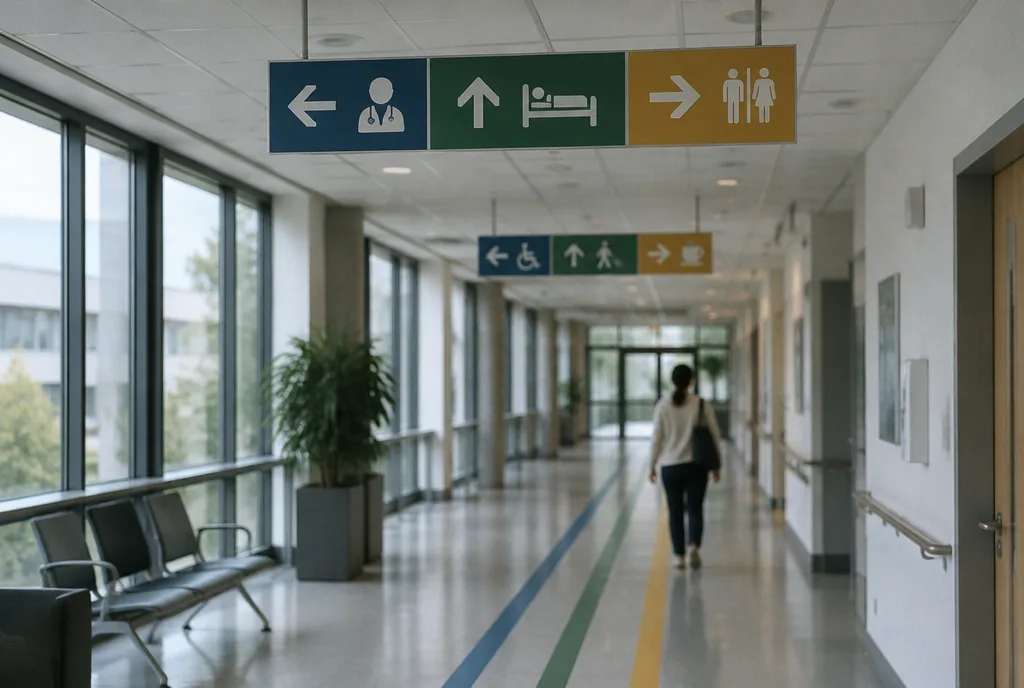
- Corridors: directional signs, zone and wing identification.
- Rooms: door plates with number and function, toilet and plant room signs.
Emergency and fire safety signage is a separate, regulated subject – the wayfinding system must take it into account so it is not duplicated or lost among the rest, but its scope is set by the fire safety specialist or the building manager.
Information hierarchy: directional signs, plans, pictograms
The most common problem in buildings we sign after years of use is clutter. A4 sheets on doors, three different plate styles, directional signs naming departments that moved long ago. A person looking for their way reads only a few words at a time.
That is why we arrange information in levels:
- Zones and main directions – large, few, visible from afar (e.g. Building B, Clinic, Registry Office).
- Detailed directions – at corridor junctions, with room numbering (rooms 101–120 →).
- Place identification – the door plate, the floor number.
No more than a few items per directional sign. Room numbers are better than names – a number does not change, staff do. Use pictograms (WC, lift, stairs, information, parking) in their standard, widely recognised form, without artistic reinterpretation. They also help foreign visitors and people who struggle to read.
In sites with several buildings or wings, colour coding works very well – each zone has its own colour, repeated on pylons, directional signs and plates.
Legibility: letter size, contrast, mounting height
| Parameter | Practical rule | Notes |
|---|---|---|
| Letter size | approx. 2.5 cm cap height for every 3 m of reading distance | a pylon read from a car needs larger letters than a corridor plate |
| Typeface | simple sans serif, no italics and no capitals for long names | short words in capitals are fine, long names in lower case |
| Contrast | a clear difference in lightness between background and letters (dark on light or the reverse) | the brand colour often needs lightening or darkening; avoid red on green |
| Surface | matt or satin | a gloss face reflects light from lamps and windows |
| Door plate | at eye level, usually beside the door on the handle side | on doors opening into the corridor the plate disappears from view |
| Suspended signs | bottom edge well above the walkway | check the minimum height in the regulations and with the building manager |
Accessibility requirements (tactile signs, Braille, contrast for partially sighted people) depend on the type of building, national regulations and funding conditions – in public buildings they are often mandatory. We provide the technical solutions, but the scope of requirements is worth confirming against the accessibility guidelines the client or building manager works to.
Materials and changeable systems
The choice of material depends on the location and how often the content will change.
- Dibond (aluminium composite) – the standard outdoors and for indoor directional signs. Rigid, weatherproof, UV-printed. Approx. €35–55 net per m². We compare it with PVC in Dibond or PVC for outdoor signs.
- Acrylic – plates on stand-off fixings, elegant office and reception signage. Approx. €43–60 net per m², stainless steel stand-offs with fitting approx. €2.35 net each.
- Foamed PVC – cheaper, for interiors and temporary signs, approx. €21–33 net per m².
- Vinyl on glass – numbers and names on glazed doors and walls, manifestation strips on glass.
- Changeable systems – plates with slide-in strips or pockets, aluminium profiles with replaceable inserts. Changing a name or department is then done by building administration, without an installation crew.
In buildings with tenant turnover (office blocks, medical centres, public offices that reorganise) changeable systems always pay off. A rigid plate printed with a company name is cheaper to start with, but every change means a new plate. More on office interior signage in our office and hotel signage offer. Prices are indicative – we confirm the final quote after the design and the sign schedule.
- 24 hexpress printing (UV inks need no drying)
- approx. 3 daysstandard lead time
- up to 14 dayslarge and custom projects with installation
Plus courier delivery. Tell us your date — we plan production around it.
Building survey and placement design
The most expensive wayfinding mistakes are made at the planning stage: a directional sign hung where an open door leaf hides it, a plate planned for a wall that does not exist (because it is glazing), room numbering that does not match the floor plan. That is why we work like this:
- On-site survey – walking the visitor's route, measuring fixing positions, photos, an inventory of existing signs. From approx. €85 net with us, refunded when you order production.
- Sign schedule – a table listing every sign: location, type, size, content, fixing method.
- Graphic design – a template for each sign type, pictograms, zone colours. Studio work costs approx. €35 net per hour; the scope depends on the size of the site.
- Placement plan – floor plans with the signs marked.
- Approval and trial – for larger orders we make single pieces to try on site.
- Production and installation – our own production and our own installation crews.
This is how our wayfinding and visual information systems service works. If the site already has floor plans in PDF or DWG, that speeds up the design.
Phased rollout and updates
Not every building has to be signed in full at once. In large sites (hospitals, campuses, public offices) we often split the rollout into phases: first the exterior and main entrances, then the lobby and main circulation routes, and finally the room plates. The condition: the design for the whole is created at the start, so that later phases look like one system rather than three separate orders.
After the rollout, a simple document is useful – a signage manual with sign templates, typeface, colours and the list of plates. With it, every new plate in a year or five years will match the rest. How to prepare such a document is described in store signage manual.
Examples of signage for specific types of building can be found on the pages for hospitals and municipal offices.