 Signs & Large Format Print
Brand guidelines vs store manual: how they differ
Brand guidelines (a brand book) say what the logo looks like: proportions, clear space, colours, monochrome versions, typography, what not to do. That is the foundation, but you cannot order a fascia sign from brand guidelines alone. They do not tell you whether the light box should be illuminated, how deep, with what face, how high above the door, or what to do when the facade has only a 60 cm free band.
A store manual goes one level down – to media and buildings. It answers the questions a contractor asks at every location:
- which medium in which situation (light box, 3D letters, projecting sign, panel),
- what dimensions and proportions, with variants for different facades,
- what materials and colours – with reference numbers, not just a colour name,
- what goes where inside and in the window,
- how to install it and who is responsible for what.
If the company does not yet have an organised identity, the order is clear: first corporate visual identity and brand guidelines, then the store manual. The difference between a logo and a broader brand system is described in logo, branding and brand guidelines.
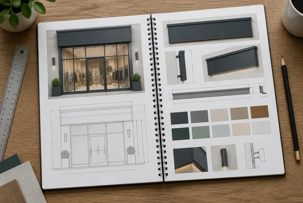
Facade: fascia sign, light box, window – variants for different buildings
The biggest mistake in the manuals we receive for production is a single facade drawing – usually an ideal unit in a new retail pavilion. Then comes a historic building in a conservation area, a shopping centre unit with a format imposed by the management, or a building where only a narrow strip above the door is available. And every contractor improvises in their own way.
A good manual anticipates several typical variants:
- Basic variant – a light box or letters on the facade, with dimensions in several sizes (e.g. S, M, L) and a scaling rule.
- Narrow variant – when the height of the band is limited; usually just the logo or letters without a background.
- Non-illuminated variant – where illuminated signage is not allowed or not needed.
- Projecting sign – at right angles to the facade, for pedestrians walking along the street.
- Shopping centre unit – taking into account the management's guidelines, which often dictate depth, lighting method and installation hours.
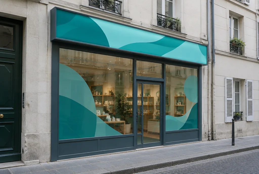
- Shop window – a layout for window graphics: a logo band, a promotional zone, opening hours, entrance marking, the height of the manifestation band on the glass.
Local regulations (landscape rules, conservation requirements, shopping centre rules) differ by place and country, so the manual should state clearly: check local requirements before ordering, and in case of conflict the variant approved locally applies.
Interior: signage, POS, zones
The interior is the second half of the manual and often the part a chain thinks about too late. It describes:
- information signage – till, fitting rooms, toilets, exit, staff-only areas; one family of plates, one typeface, one mounting height,
- sales zones – wall graphics, islands, above-fixture graphics, positioned on a typical unit plan,
- POS materials – wobblers, shelf stoppers, price tags, shelf strips, standees – with formats, so campaigns can be printed in series for all locations,
- frames and changeable media – where poster or fabric frames hang, in which only the print changes each season,
- back of house – health and safety information, staff boards, if head office wants them standardised.
In practice the biggest saving comes from standardising the formats of changeable media. If every location has frames of the same size, a seasonal campaign is one print order and one shipment to many stores, not twenty separate quotes.
- 01Brief
Description, sizes, site photos and deadline — a few sentences are enough.
- 02Design and quote
Our designers prepare artwork or a visualisation and you get a price.
- 03Approval
You approve the design; for brand colours we provide a proof.
- 04Production
35+ machines in our own plant in Poland: 3.2 m UV print, CNC, laser, 3D, sewing.
- 05Installation or delivery
Own crews and vehicles across Europe, partner network, couriers worldwide.
Technical specifications: materials, colours, dimensions
| Field | What to enter | Why it matters |
|---|---|---|
| Name and code | e.g. E-01 facade light box, size M | Ordering by code without describing it again |
| Dimensions | Width, height, depth, scaling rule | The same look in different units |
| Construction | Profile, face, lighting type, IP rating | Comparable bids from different contractors |
| Colours | Reference (e.g. Pantone), CMYK values, vinyl type | Consistent colour between locations |
| Artwork | Master file, clear space, minimum logo size | No file rework on site |
| Installation | Height, fixing method, power, responsibility | Fewer surprises at installation |
| Replacement and service | What is replaced, how often, how to order a part | Keeping the standard over the years |
This chapter is the most useful to the contractor – and most often too general. Illuminated light box in brand colour is not enough: every medium should have its own sheet with fields like those in the table above.
For colours, it is worth entering not only the reference number but also how to judge a match – more in our guide on consistent colour in series production. Our studio can prepare working drawings and media specifications for existing brand guidelines; a technical design with fixing specifications is priced from approx. €85 net per site or media type, and we confirm the details once you contact us.
Procedure for a new location and franchisee
A manual without a procedure is a document that sits in a drawer. What works best is a simple path that every new branch and franchisee knows:
- Registering the unit – address, photos of the facade and interior, dimensions, information on local requirements.
- Survey – on site, or following the measuring instructions in the manual. We carry out on-site surveys and inventories from approx. €85 net, credited when production is ordered. How to organise this across many locations is covered in our guide on site surveys before a campaign.
- Choosing variants – from the media catalogue in the manual, without designing from scratch.
- Visualisation and approval – head office approves before anything goes into production.
- Local formalities – consent from the shopping centre management, the building owner or the local authority, where required.
- Production and installation – timed to the opening.
- Sign-off with photos – documentation that the location matches the standard.
For franchises, it is worth stating in the manual which elements are mandatory and which optional, and from whom the franchisee should order them. One contractor for the whole network makes consistency easier – for rollouts in many locations at once, a network rollout with reporting works well.
Updating the standard and checking compliance
A manual ages: the logo changes, the colour changes, a new unit format is added, a supplier discontinues a vinyl. It is good to have one person or department responsible for the document version, and the version date on every page. Old versions in circulation are a quick route to locations that look almost the same.
Compliance checks are easiest to base on photos: after every installation and, for example, once a year from every location. Comparing them with the media sheet quickly shows where a light box has burnt-out modules, where window vinyl has faded and where someone has stuck their own sheet of paper on the door.
In a rebrand the manual is the basis for costing the whole changeover – a list of media with codes and dimensions makes it possible to quote for the network without visiting every location again.