 Signs & Large Format Print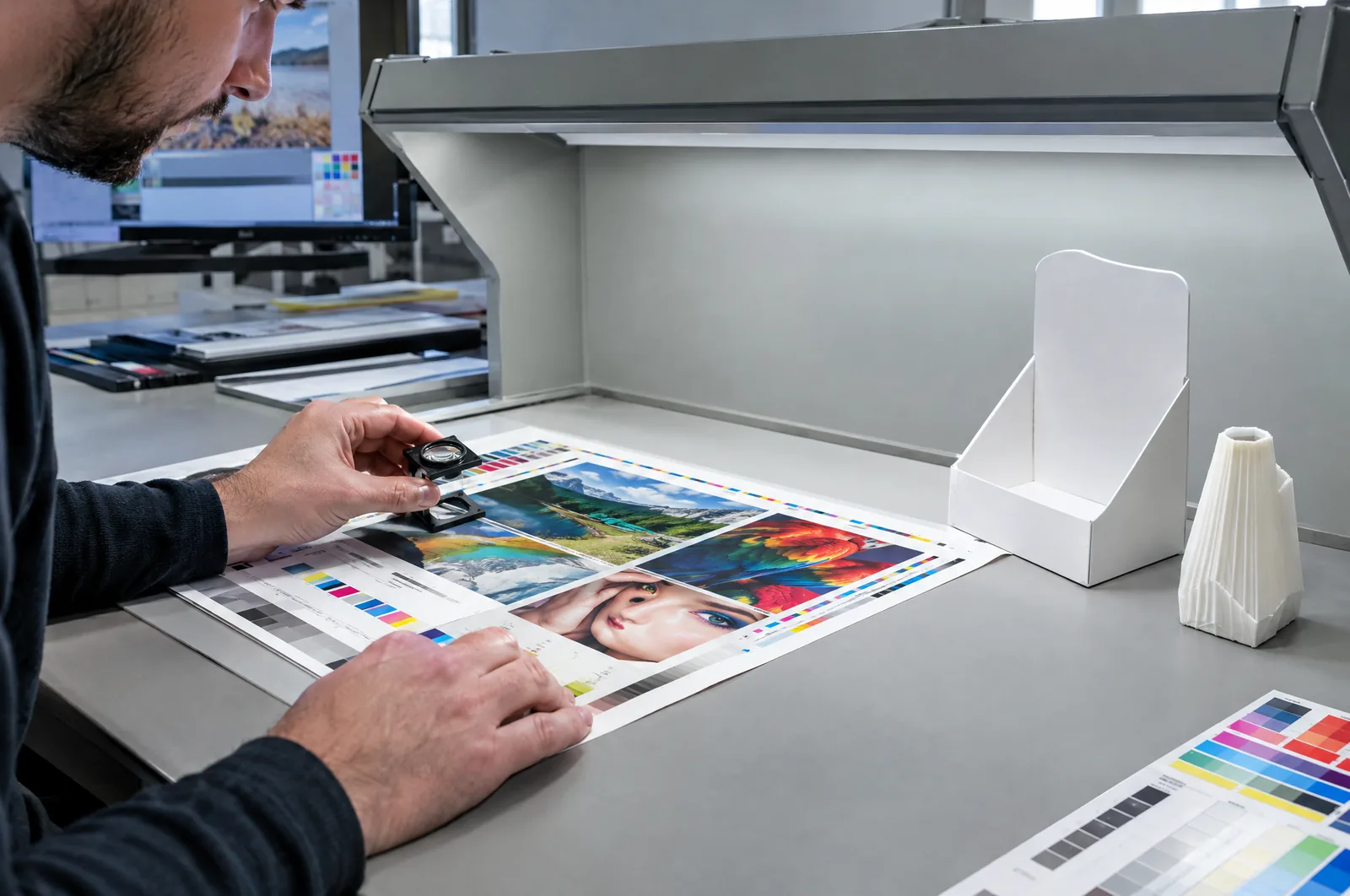
Why the same file looks different on banner, vinyl and fabric
A file is just numbers. The colour you see at the end is created by ink and substrate – and every substrate behaves differently. PVC banner has a slightly greyish, matt surface. Monomeric vinyl is smooth and often glossy, so the same blue looks livelier on it. Polyester fabric absorbs ink into the weave, the colour becomes softer and slightly darker, and with dye sublimation the dye penetrates the fibre, giving a different depth from UV printing on the surface.
Then there is the white of the substrate. One banner has a cool, slightly bluish white, another a warmer one. On large solids – uniform backgrounds in a brand colour – the difference is visible to the naked eye, especially when two graphics hang side by side.
The third reason is light. A colour judged under fluorescent office lighting looks different in a shop window in sunlight, and different again in a backlit light box. That is why we print materials for backlighting with a separate correction – otherwise the red in a light box comes out pink.
The most common mistake on the client's side is expecting the screen colour to transfer one to one to all media. A screen emits RGB light; print reflects light in CMYK – more on this in CMYK or RGB.
The colour master and reference sample
Without a master there is no control – only an eyeball judgement of each batch, by a different person every time. That is why for retail chain campaigns and repeat orders we start by agreeing what we compare against.
- A Pantone number or another swatch reference – a good starting point for a brand colour. Bear in mind, however, that not every Pantone colour can be reproduced in CMYK on every material; some fall outside the machine's gamut. We cover the details in our guide on Pantone colour matching and proofs.
- A test print on the final material – A3 on exactly the banner, vinyl or fabric that production will use. It is the simplest and cheapest master: approx. €13 net each.
- A certified contract proof – a print documenting the conditions it was made under. Useful when colour must be formally confirmed, e.g. for sign-off by head office marketing. Approx. €38 net.
- A physical sample from the client – a piece of a previous job, packaging, a paint swatch. That works too, as long as it is clean and unfaded.
We label the approved sample (material, date, file version) and keep it. The client should keep their own copy – then both sides compare against the same thing.
With several materials at once – e.g. a banner, window vinyl and a fabric frame – it is worth approving a sample on each of them separately, laid side by side. It is the only honest way to see how close they can get.
Machine and material profiles
Every combination of printer, ink and material has its own colour profile – a description of how to convert the colours from the file so they come out as faithfully as possible on that particular substrate. The same banner printed with a different profile can come out noticeably warmer or cooler.
In practice this means a few rules we stick to:
- We print on the same, proven materials. Changing the banner or vinyl supplier mid-campaign risks a shift in shade, even if the specifications on paper are the same.
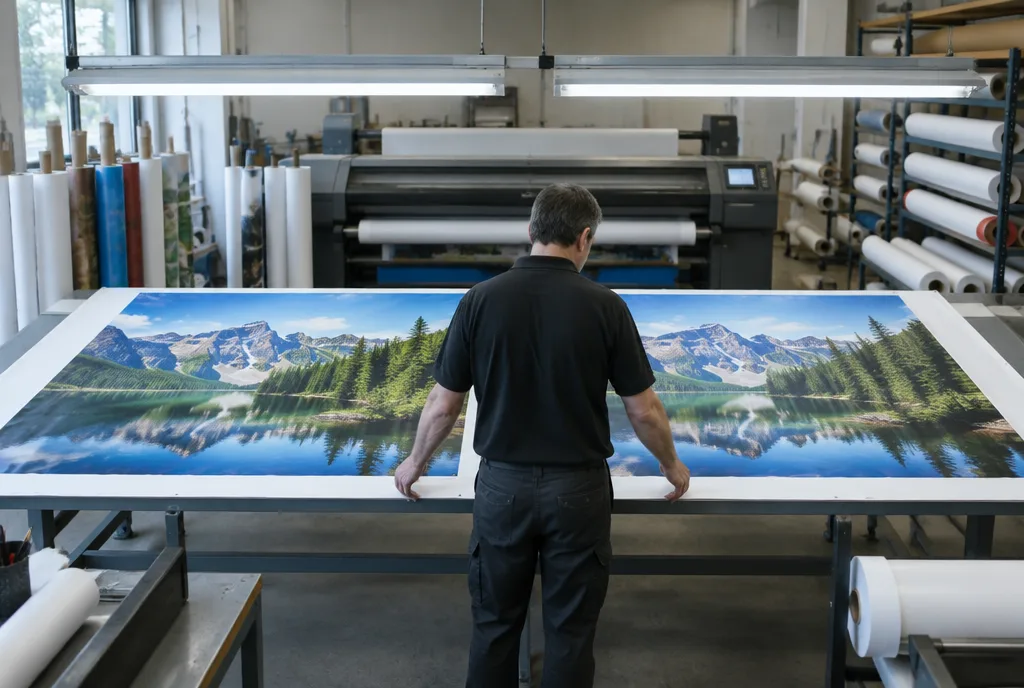
- A series of one graphic runs on one machine and one profile. We have two industrial UV printers 3.2 m wide, but a large order for a single graphic is not split between different settings without checking.
- Backlit materials, textiles and sublimation have separate profiles – it is not the same print on a different material.
- With a new material, we make a sample first and only then go into production.
The differences between technologies – UV, sublimation, solvent, latex – are covered in solvent, latex or UV printing.
Control in production: measurement, comparison, records
| Stage | What is checked | Why |
|---|---|---|
| File intake | Colour mode, profile, spot colour definitions, resolution | So the brand colour is not converted differently every time |
| Master | Test print or proof on the final material, approval | The reference point for the whole series |
| Start of printing | Comparing the first sheets or metres with the master | Catching a deviation before the whole run is printed |
| During the series | Spot checks, especially on large solids | Detecting shifts after a roll change or long machine runs |
| Before packing | Comparing finished items in different materials side by side | Checking the set that will go to one location |
| Archive | Record: material, profile, file version, date, sample | The ability to reproduce it for a reorder |
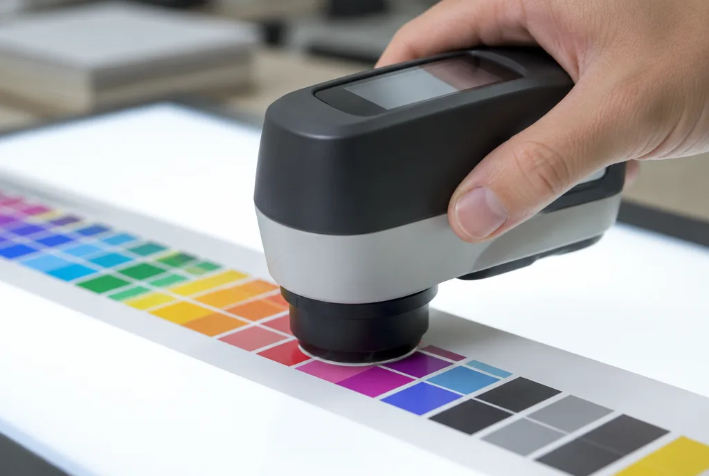
In the industry colour difference is expressed as ΔE (delta E). It is measured with an instrument that compares the colour of the print with the master. Below a ΔE of about 2, an average observer usually sees no difference in a side-by-side comparison; at 3–5 the difference is visible when the graphics lie together, but separately it does not usually jar. These are rough values – a lot depends on the colour, because the eye is more sensitive in greys and beiges than in saturated reds.
Reorders months later: how to stay consistent
The hardest situation is a reorder: the chain opens a new location or replaces one damaged graphic, and next to it hangs material from a year ago. The old one has already changed – sun and time take their toll, especially outdoors. A new print, perfectly matched to the master, may look too strong beside it.
What helps:
- The same source file. Not an export of an export, not a version reworked by someone along the way. Ideally the file archived at the first production.
- The same records. Material, profile, settings – if they are written down, reproducing them takes moments.
- A retained master sample kept somewhere dark, not in a shop window.
- A conscious decision – when replacing one graphic on a wall with several older ones, it is sometimes better to replace the whole set than to fight to match faded material.
With ongoing cooperation a framework agreement with a printer also helps, setting out the materials and how colour is approved. Then a reorder does not start from scratch.
What the client can do on their side
Colour control also depends on the client. A few things on the client's side make a big difference:
- Define brand colours in one document: Pantone, CMYK values for print, and possibly separate values for textiles. If you have brand guidelines, hand them over straight away.
- Prepare files in CMYK with brand colours always defined in the same way – not by eye in each design.
- Approve samples on each material used in the campaign, and keep them yourself.
- Judge colour in daylight or in the light the graphic will hang in – not on a monitor.
- Do not mix suppliers in one campaign if consistency matters to you. Two printers, even good ones, will give two shades.
- For multi-site campaigns order the whole set from one source – together with campaign sets for retail chains and dispatch to locations.
If you are preparing a retail network rollout, agree the colour master right at the start, together with the site surveys – not a week before printing.