 Signs & Large Format Print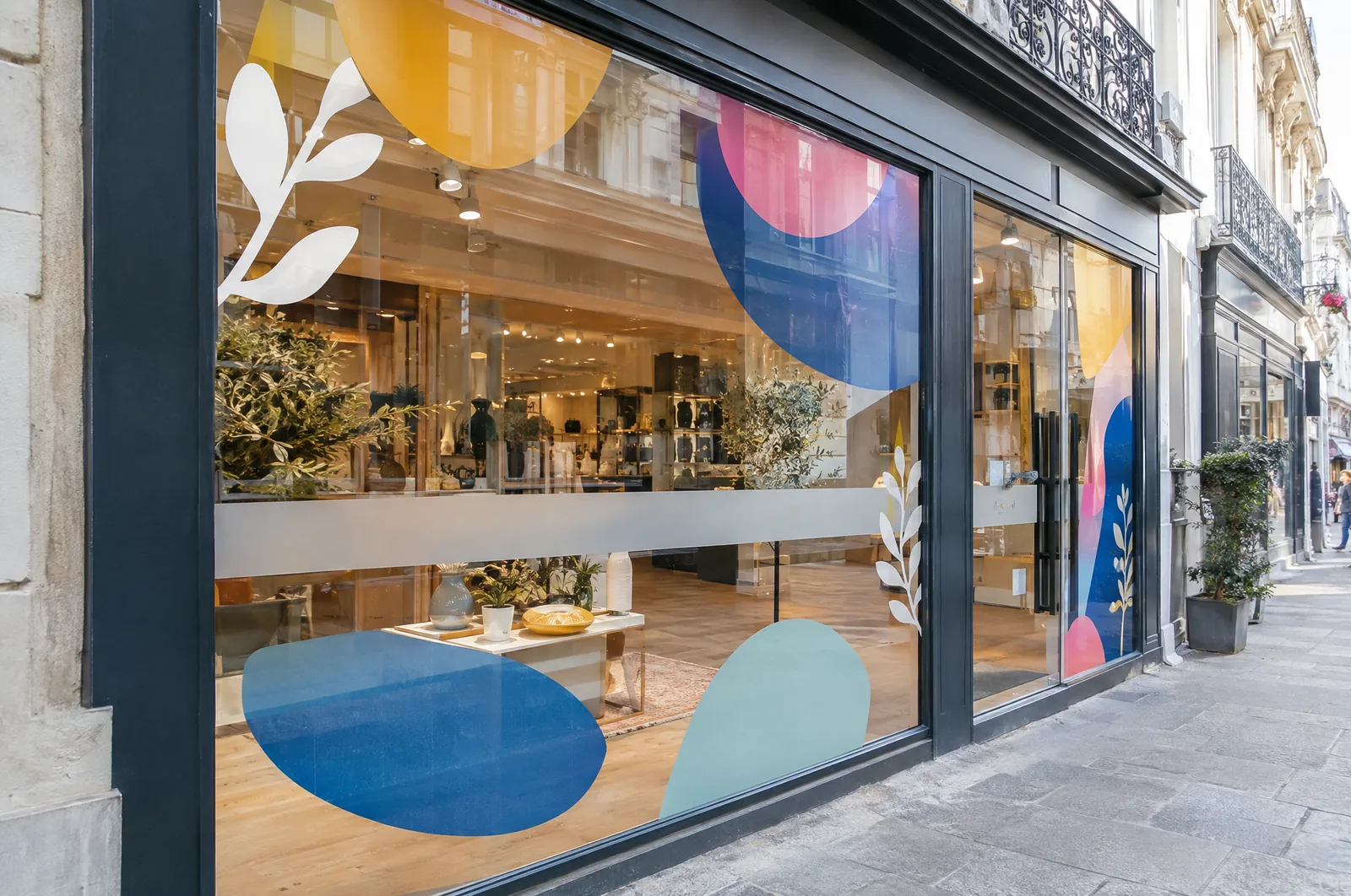
Visual merchandising vs merchandising: how they differ
Merchandising in the broad sense is the decision about what goes on the shelf: range, quantity, prices, turnover. Visual merchandising answers the question of how it looks and in what order the customer sees it.
A real-life example: the same store with the same stock can sell noticeably better after changing the fixture layout, the lighting at the entrance and the department signage. Nothing changed in the offer – what changed is whether the customer notices it.
In practice VM combines several things:
- store layout and customer route,
- product display (height, grouping, quantity on the shelf),
- communication: department signs, prices, promotions,
- lighting, colour and large format graphics,
- the shop window as an invitation inside.
We deal with the last, physical layer: we print, cut, sew and install what the VM designer or the store owner has come up with. We often also help plan it, because we see dozens of stores and know what works.
Store zones: entrance, customer route, hot and cold spots
Every store has zones that customers pass without looking and zones where they slow down. A good layout starts with identifying them.
- Entrance (decompression) zone – the first 2–3 metres inside the door. Customers are only just slowing down and looking around, so small products and small text get lost. One big message works better here than five small ones.
- Main route – usually leads to the right and towards the back of the store. Products that need to sell and promotional displays go along it.
- Hot spots – fixture ends, the area around the till, the wall visible from the entrance. New products and promotions go here.
- Cold spots – corners, the back of the store, fixtures in side aisles. For customers to get there, they need a reason: everyday essentials, clear department signage or a graphic that catches the eye from a distance.
To draw customers into cold zones, floor graphics with arrows or a path work well, as do large wall graphics on the back wall. Floor vinyl must have an anti-slip laminate – on smooth vinyl and a wet floor, someone will eventually fall.

The shop window as the first display
The shop window is the only part of the store seen by people who have not come in yet. The most common mistakes we see:
- A window covered entirely with notices – passers-by see neither the products nor the interior.
- Too much text. From the pavement, on the move, people read a few words, not a paragraph.
- Decorations not changed for years, faded by the sun.
- No indication of what the store does when the interior is hard to see.
A sensible layout is: name and trade readable from a distance, one main message (season, new arrival, promotion) and space left to see inside. If the back-of-house area needs to be hidden, One Way Vision film works – full graphics from outside, a view of the street from inside.
More on window design in our guide how to design a shop window. We produce and fit the film as part of our shop window graphics service.
- 01Brief
Description, sizes, site photos and deadline — a few sentences are enough.
- 02Design and quote
Our designers prepare artwork or a visualisation and you get a price.
- 03Approval
You approve the design; for brand colours we provide a proof.
- 04Production
35+ machines in our own plant in Poland: 3.2 m UV print, CNC, laser, 3D, sewing.
- 05Installation or delivery
Own crews and vehicles across Europe, partner network, couriers worldwide.
Department signage and price communication
Customers who cannot find a department rarely ask – more often they leave. That is why signage should be visible above the fixtures, i.e. high up: suspended boards, wall lettering, hangers.
A few rules that work in practice:
- one department name = one colour or pictogram throughout the store,
- department names readable from the other end of the floor (in a hall several dozen metres long, letters need to be well over ten centimetres high),
- price messages in one fixed layout – customers learn where to look for the price,
- promotions highlighted in a different colour from the regular price, but within the same graphic family.
On the shelves, wobblers, shelf stoppers and price markers do the work – usually HIPS or PVC with UV print. Beware of overload: when ten wobblers hang on one fixture, none of them works. We cover this in more detail in our guide on POS materials.
Light, colour and large format graphics
Light determines where the customer looks. A more brightly lit wall draws the eye and brings the back of the store closer. Dark corners stay empty.
This is where illuminated LED fabric frames work well: a large, evenly lit graphic that can be replaced without dismantling the frame. A light box with an SEG fabric face starts from approx. €300 net/m², and an ultra-slim A1 LED light box from approx. €165 net.
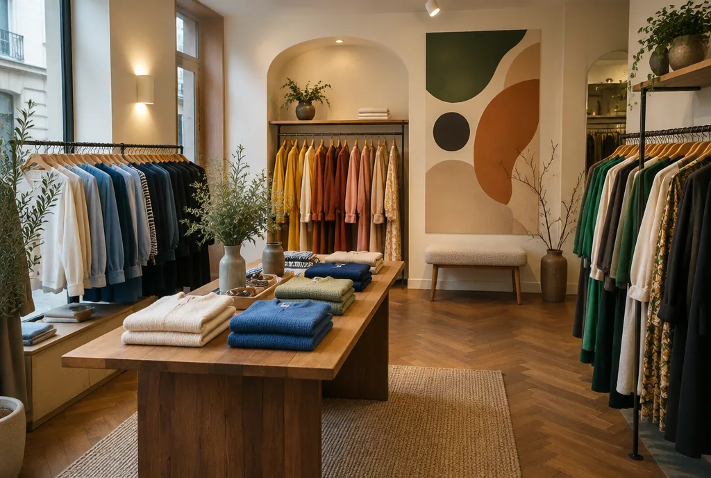
With colour it is simple: the fewer colours in the communication, the more the product stands out. Graphics should be a backdrop for the product, not compete with it. In fashion stores large photos in the collection's colours and a calm background are often enough.
For dedicated brand zones (e.g. one manufacturer inside a larger store), shop-in-shop fit-outs are used. A 100 × 230 cm SEG frame module with graphics costs from approx. €160 net with us, and replacing the graphic alone from approx. €65 net.
Changing seasonal displays: how to plan it
Seasonal displays most often go wrong at the scheduling stage. Christmas graphics ordered a week before the promotion mean a rush, express surcharges and installation during opening hours.
Our proven schedule:
- 6–8 weeks before the season – decide on the theme and the list of media (window, floor, walls, shelves).
- 4–5 weeks – design and file approval, measuring any new locations.
- 2–3 weeks – production (standard about 3 working days, larger sets up to about 14 days).
- One week before – dispatch or installation, ideally outside store hours.
- After the season – removal and, if needed, storage of reusable elements.
It pays to design seasonal graphics so that the structures stay and only the graphics change: a fabric frame, a light box with a replaceable face, magnetic panels. More ideas in our guide on seasonal retail advertising.
A VM standard for a store network
| Element | What to agree | Typical media |
|---|---|---|
| Shop window | zone layout, glass dimensions in each store | vinyl, OWV, light boxes |
| Department signage | colours, pictograms, hanging height | suspended boards, hangers |
| Price communication | price tag and wobbler templates | HIPS, PVC, price rails |
| Promotional zones | positions for displays and campaigns | display units, SEG frames |
| Floor | routes, zones, markings | floor vinyl with R10 laminate |
| Campaign changeovers | dates, list of media per store | campaign kits |
In a network, most problems come from differences between locations: different window widths, ceiling heights and fixtures. That is why before the first campaign the stores are surveyed (approx. €85 net per site with us, refunded when you order production) and everything is written down in a standard manual – we covered this in our guide on the store signage manual.
After that, each campaign is a kit per store, assembled and shipped to the store's address. Assembling a kit costs approx. €3.30 net per location, multi-address shipping approx. €2.80 net per location. Details in our campaign sets for retail chains offer. With networks that have stores in several countries we talk in their language – we work in 14 languages.