 Signs & Large Format Print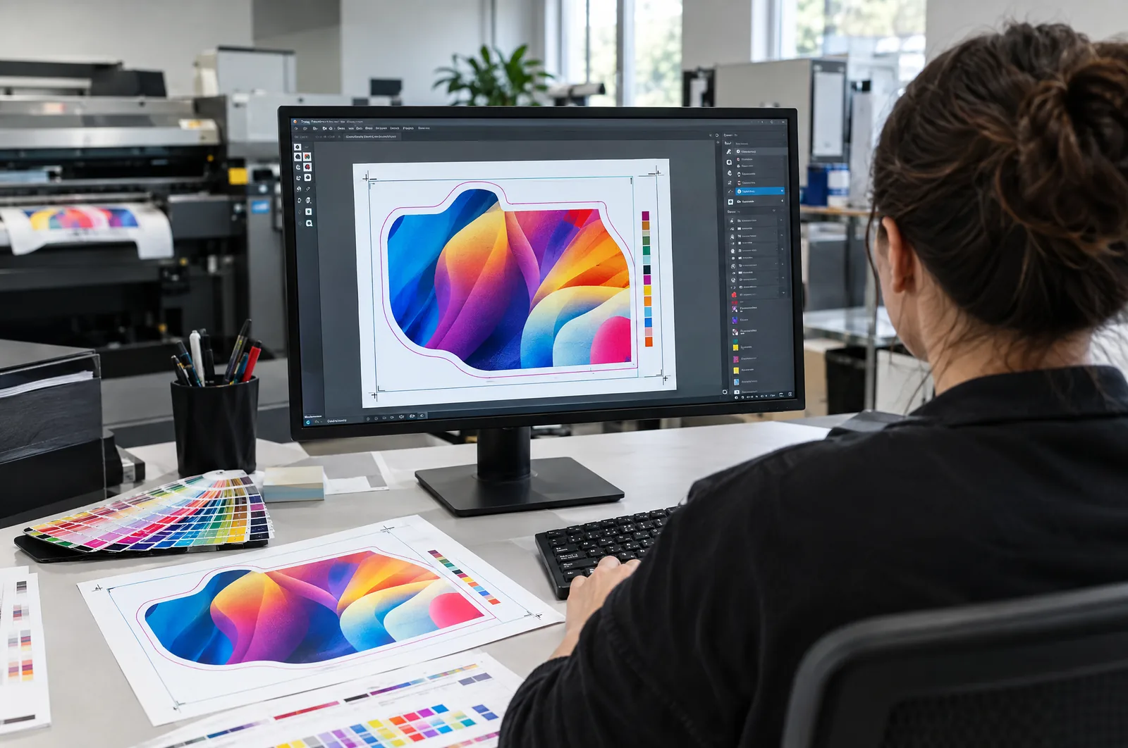

PDF/X-1a or PDF/X-4: which standard to choose
PDF/X is a variant of PDF made specifically for print. It enforces things an ordinary web PDF skips: embedded fonts, a defined output profile, correct page boxes (trim and bleed). There are mainly two options to choose from.
PDF/X-1a is the older, very conservative standard. Everything must be in CMYK (plus any spot colours), and transparency is flattened on export. The upside is predictability; the downside is that flattening can chop artwork into pieces, and shadows and effects may show stepping.
PDF/X-4 keeps transparency and layers live, allows RGB objects with a profile and leaves colour conversion to the press. Today it is a sensible default, including for us – as long as the colours in the design are deliberately set in CMYK.
Our advice: if you do not know what to choose, go for PDF/X-4. If the design has many effects, shadows and transparencies, all the more reason for X-4. If the printer explicitly asks for X-1a, export X-1a and zoom in on the PDF to check that flattening has not broken anything.
Bleed, crop marks and the safe area
Every element that reaches the edge must extend beyond the page into the bleed. For flyers, business cards and catalogues this is usually 3 mm on each side – an A5 flyer of 148 × 210 mm measures 154 × 216 mm in the PDF. In large format the bleed depends on how the product is finished: one for a banner with welded hems, another for a Dibond sign, and yet another for a graphic tensioned on a frame. Details and examples are in what is print bleed and in our guide how to set up a banner print file.
Crop marks – add them if the printer asks; in that case set the mark offset in the export to at least the bleed so they do not overlap the artwork. Many printers (including us) manage without them if the PDF has correct TrimBox and BleedBox settings.
The safe area is a margin inside the page where no important text or logos go. For small formats it is usually 3–5 mm from the trim line, more in large format – on a banner with eyelets, text must stay out of the eyelet zone.
Fonts, colour and images: the three things that ruin most files
Fonts. In PDF/X fonts must be embedded – the export simply will not go through if one is locked. The alternative is converting text to outlines (curves). We always do this for logos and short slogans; for longer text embedding is better, because it keeps small type sharp and allows minor corrections.
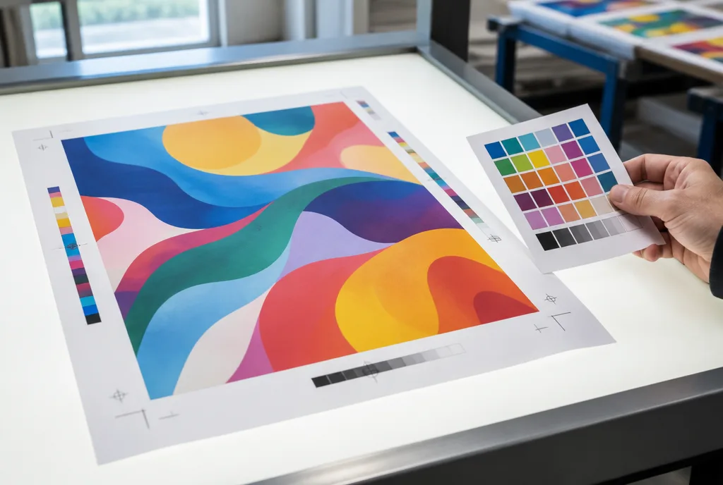
Colour. Prepare print designs in CMYK, with a profile matching the substrate (coated or uncoated). Keep Pantone brand colours as spot colours only if they will be printed with a separate ink – in digital and UV printing they are usually converted to CMYK, and colour match is checked on a proof. We cover black and ink limits separately in black in print: rich black.
Images. For print viewed up close (flyers, catalogues, posters), aim for about 300 dpi at final size. For large formats viewed from a distance much less is enough – 100–150 dpi at 1:1, and even less for a billboard. A photo downloaded from a website and stretched across a one-metre banner will be blurry whatever the export settings. More in our guide large format print resolution. Set export compression to maximum-quality JPEG or ZIP – not smallest file size.
Exporting from InDesign, Illustrator, Affinity and Canva
| Program | Export path | What to watch |
|---|---|---|
| InDesign | File → Export → Adobe PDF (Print), preset PDF/X-4:2008 | Marks and Bleeds tab: tick Use Document Bleed Settings; Output tab: profile matching the substrate |
| Illustrator | File → Save As → Adobe PDF, preset PDF/X-4 | set bleed on the artboard; one artboard = one page; check for hidden objects outside the page |
| Affinity Designer / Publisher | File → Export → PDF, preset PDF/X-4 or PDF (for print) | tick Include bleed; check the document CMYK profile before exporting, not only in the export dialog |
| Canva | Share → Download → PDF Print | tick crop marks and bleed; in the paid version choose the CMYK profile; check that background elements extend beyond the page edge |
| Word / PowerPoint | Save as PDF (option Standard – publishing online and printing) | no bleed and no CMYK – fine for simple office printouts; for flyers and posters move the design into a graphics program |
Whatever the program, open the PDF after export and view it at 200–400% zoom. Look for shifted letters, missing fonts (replaced with Arial or Courier), stepping in shadows and white lines along the edges. Five minutes of checking saves a day of corrections.
Checklist before sending your file
- The trimmed size matches the order (for large formats: the scale is in the file name, e.g. 1:10).
- Bleed added on all sides; backgrounds and photos extend into the bleed.
- Important content sits in the safe area, away from the trim line and the eyelet zone.
- Colours in CMYK, black text in 100% K, large black backgrounds in rich black, no registration colour.
- Fonts embedded or converted to outlines.
- Images at the right resolution, without web compression.
- No working layers, comments, hidden objects or guides in the PDF.
- One design = one file; with several versions (e.g. different sizes) clear file names.
- Die line, spot varnish or white underprint on a separate layer or in a spot colour with the name we agreed.
- The file has been viewed after export, not just in the source program.
Every file we receive goes through a technical check (preflight) – included in the order price. We catch missing bleed, RGB, low resolution or unembedded fonts and let you know before anything goes to print. If you would rather someone else prepared the file from scratch, our DTP studio will do it; adapting a finished design to another size costs approx. €13 net per item, and we confirm the final price after seeing the materials.