 Signs & Large Format Print
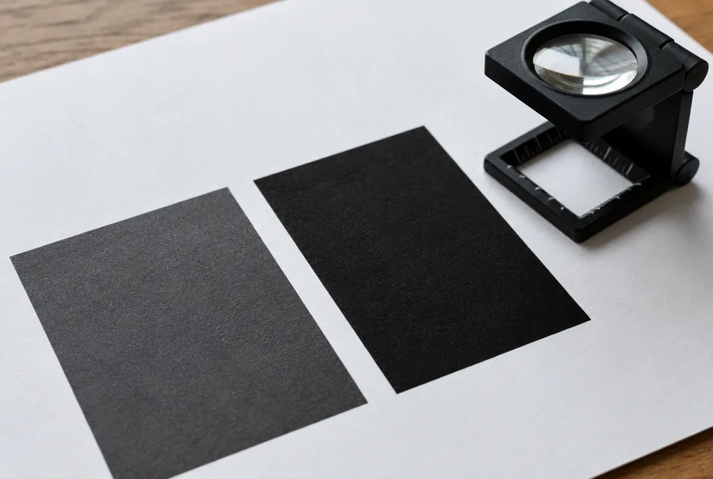
Why 100% K looks grey on a large area
Black ink (K) in CMYK printing is not perfectly opaque. You will not notice on small text, but on a large solid – a flyer background, a black sign, a banner with a dark background – 100% K looks dark grey, sometimes slightly brown or washed out. On top of that, the paper texture shows through a layer of black alone, and every stripe or unevenness in ink laydown becomes visible.
You will not see this on screen. A monitor displays 100% K as a deep black, so the design looks fine until the print arrives. It is one of the most common colour complaints clients bring to us – when in reality the file was simply set up for text, not for a large background. We cover the differences between screen and print in more detail in CMYK or RGB.
The solution is to add some of the other colours under the black. Cyan, magenta and yellow build up the layer, fill it in and give a deep, saturated black. Hence the name: rich black.
Rich black: typical values and the ink coverage limit
| Black | C / M / Y / K values | Total ink | When to use |
|---|---|---|---|
| Pure black | 0 / 0 / 0 / 100 | 100% | text, fine lines, codes, small elements |
| Neutral rich black | 60 / 40 / 40 / 100 | 240% | large backgrounds, headlines, black solids – a safe standard |
| Cool black | 60 / 0 / 0 / 100 | 160% | when the black should lean towards navy, in cool-toned designs |
| Warm black | 0 / 60 / 30 / 100 | 190% | photos and warm-toned designs, browns |
| Registration black | 100 / 100 / 100 / 100 | 400% | never in a design – only for printer's marks |
Why not just set everything to 100%? Because every print process has a total ink coverage limit (TAC – total area coverage). Coated paper in offset typically takes about 300–330%, uncoated paper less, about 260–280%, newsprint even less. Above the limit the ink does not dry, sets off onto neighbouring sheets, the paper cockles, and the ink cracks when cut or creased.
That is why the 60/40/40/100 standard is convenient: it gives a deep, neutral result and stays comfortably within the limit of practically any substrate. If your design has a lot of black on uncoated paper, ask us before exporting – sometimes it is better to drop to 50/40/40/100.
One important point: all black elements in a design should use the same recipe. If the logo is 100% K and the background 60/40/40/100, you will see two different blacks side by side – a grey patch on a deep background.
When not to use rich black
Rich black is made of four inks laid down in four passes or by four print heads. These layers never sit perfectly on top of each other – a slight misregistration is normal. On a large solid you will not see it. On a small element it shows immediately: coloured fringes, blurred edges, a ghost next to a letter.
That is why we keep these in 100% K:
- body text and small type (roughly below about 12 pt, and even larger in serif typefaces),
- fine lines, frames, tables, dividers,
- barcodes and QR codes,
- reversed-out text on a black background – be especially careful here: a small white letter knocked out of four inks quickly fills in.
Pure black text should also be set to overprint. It then prints on top of the background instead of knocking a hole in it, so even with slight misregistration no white gap appears. InDesign does this by default for the [Black] swatch; in other programs you need to check.
Black in large format and UV printing
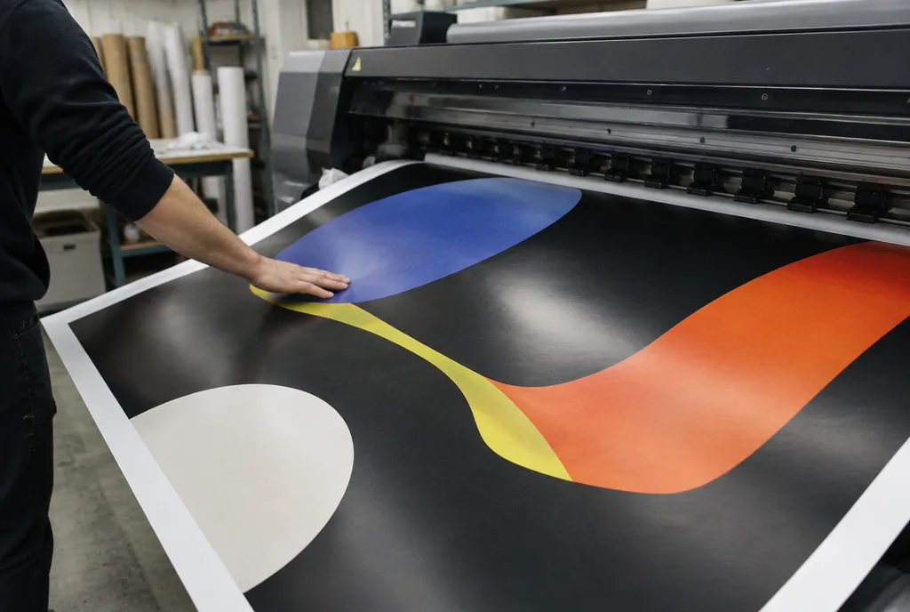
In large format printing the rule is the same, just at a different scale. A banner or sign with a black background viewed from several metres away will immediately reveal the greyish black of 100% K, especially in sunlight. That is why we ask for rich black on large backgrounds, and we fine-tune the rest in production for the specific material.
A few practical notes from our production floor:
- UV printing cures the ink with light instantly, so drying is not an issue, but too thick an ink layer on a flexible material (banner, vinyl) can crack when bent or rolled. 400% black on a banner is asking for trouble.
- Backlit materials (backlit film, light box faces) need more ink so the black does not let light through. We handle this on our side with production profiles – leave a normal rich black in the file and do not add anything extra just in case.
- Printing on acrylic and glass needs a white underlayer or an extra layer if the black must be opaque. That is also on our side, but state in the order whether the black must block light fully.
- Textiles and sublimation have their own limits – black on fabric always looks slightly different from black on vinyl.
When a black background is the key element of the design (a premium showroom, a light box with a black face), order a test print on the final material. An A3 proof costs approx. €13 net and settles doubts better than a debate about CMYK values. Prices are indicative – we confirm the final amount once you contact us.
Registration black: the mistake that ruins a print
Design programs have a colour swatch called Registration. On screen it looks like the blackest black, so designers sometimes reach for it. That is a mistake. Registration prints on every plate and with every ink at 100%, i.e. 400% coverage. It is meant only for crop and registration marks, which sit outside the page anyway.
The same happens when a designer converts a black photo or vector from RGB the quick way and ends up with something like 75/68/67/90. The total exceeds 300%, and the print shows streaks, show-through on the reverse and set-off onto neighbouring sheets.
When preparing files, our studio catches such areas during technical checks (preflight) and corrects them before production, but it is better to have a clean file from the start – then there is no risk that a correction changes the character of the design.
How to check the black in a PDF before sending
A few minutes with free or standard tools is enough:
- Separations preview / Output Preview (Acrobat Pro, InDesign). Hover over the black background and read the C, M, Y, K values. Text should be K only, backgrounds your chosen rich black recipe.
- Coverage limit – in the separations preview, enable highlighting of areas above e.g. 300%. If anything lights up, fix it in the source file.
- Overprint Preview – check that black text prints over the background rather than knocking out its shape.
- Photos – dark areas of photographs also count towards the limit. When converting to CMYK, use a profile that matches the substrate, not the default settings.
- Logos and vector elements – make sure they do not contain registration black or four inks at 100%.
If you do not have Acrobat Pro or do not want to go into this, send us the file – technical checking is included in the order price. More on how to save the file in our guide print-ready PDF: export settings. If the design does not exist yet, our DTP studio will prepare it with the right settings from the start.